Panama City Studios
Website Redesign | Logo Design
The Butterfly In A Digital World
Panama City Studios, a digital consulting studio, needed a logo redesign and new website. The old logo contained a butterfly (which represents Panama), including the colours and the stars of the Panama flag. It was critical to keep all these elements for the new logo.
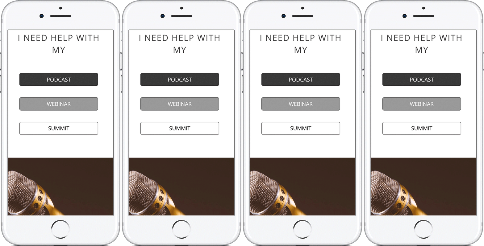
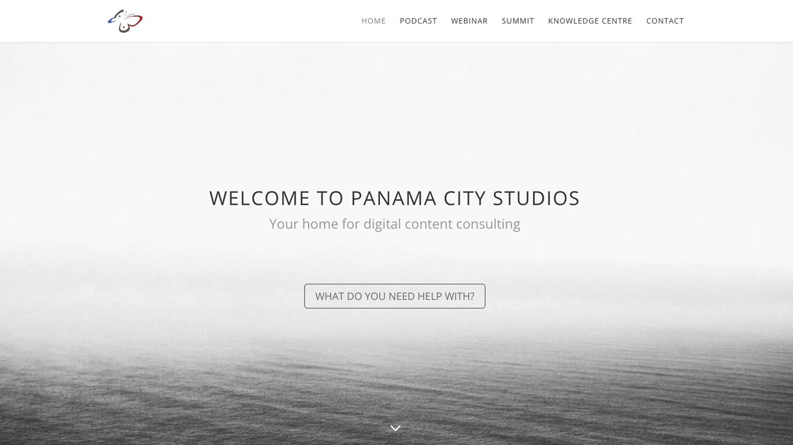
Panama City Studios specializes in podcasts, webinars, summits, and digital conferences. The goal of the website is to provide information about their services. When I first heard about the company, I immediately envisioned a modern/sleek looking website.
The colours used are tone in tone: grey, white, and beige tones that give the website a sophisticated appearance. The customer easily navigates through the site depending on what information they are seeking.
Looking at the new website, I think the lively butterfly logo and the clean, simplistic website complement each other well. The contrast is effective.


