Listraor
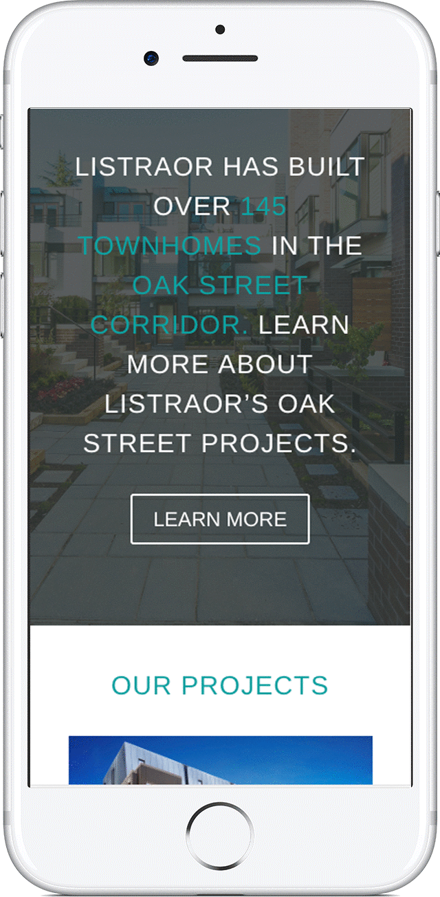
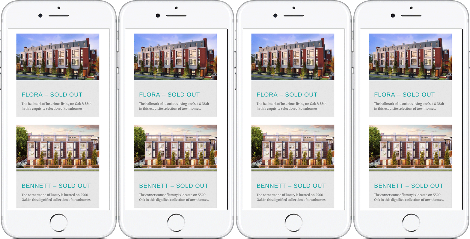
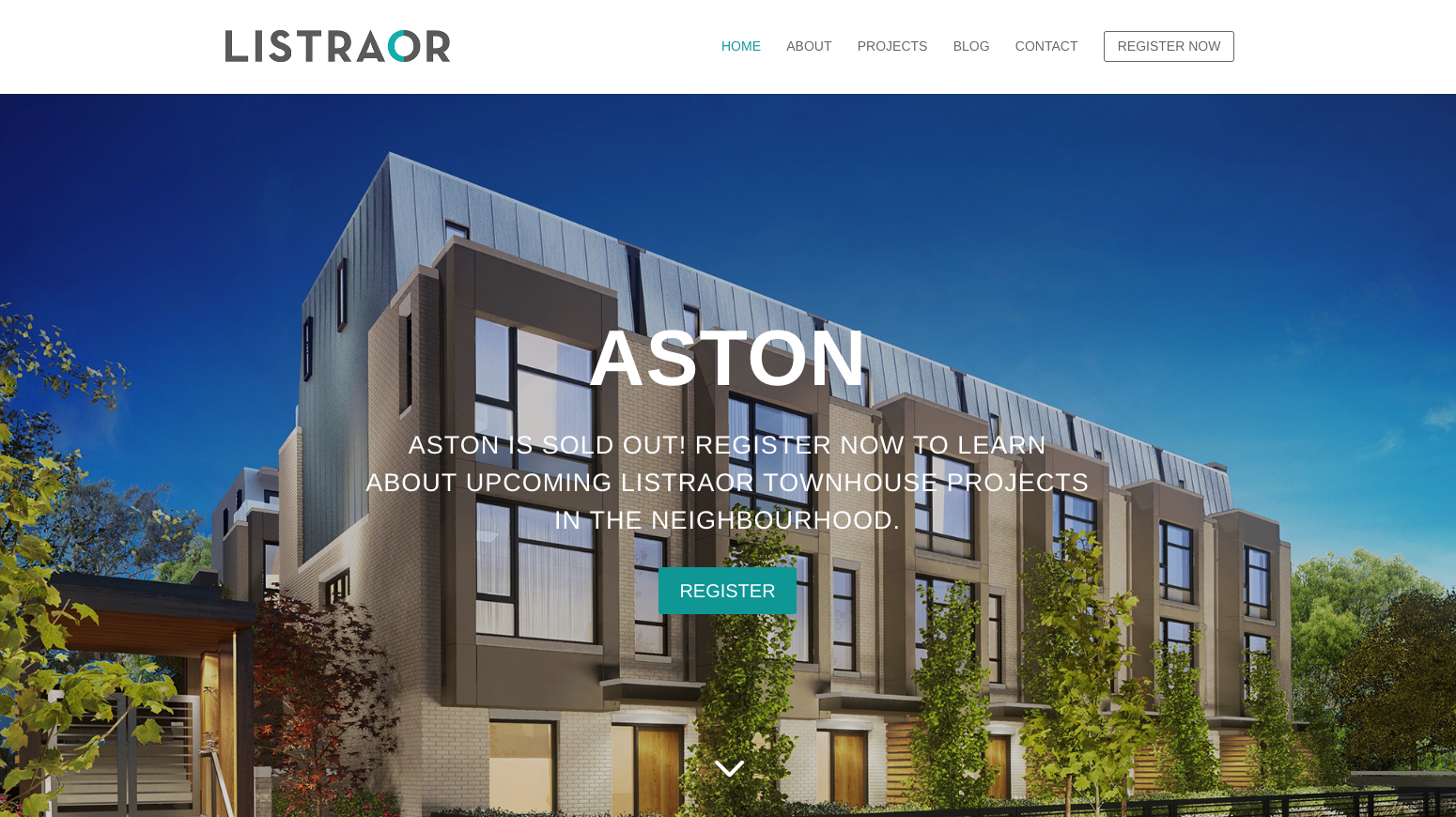
Listraor required a website redesign. The goal was to keep the look and feel of the site, but make it more user-friendly and modern looking.
The old site contained a lot of subsections and the navigation felt a bit confusing with the menu bar placed at the bottom.
I simplified the navigation and made it easier for people to find what they are looking for. Visitors can be looking for very different information. For example, homeowners may wish to get in touch with customer service, while potential homebuyers seek information on current/past projects and to find out what Listraor is about.
I’m very happy with how the redesign turned out. The website is now more sales focused and customers have a more enjoyable website experience.


